Lyle & Scott’s identity had become closely associated with a harsh, subcultural crowd, limiting wider appeal.
Defining a brand with outstanding heritage.
Lyle & Scott
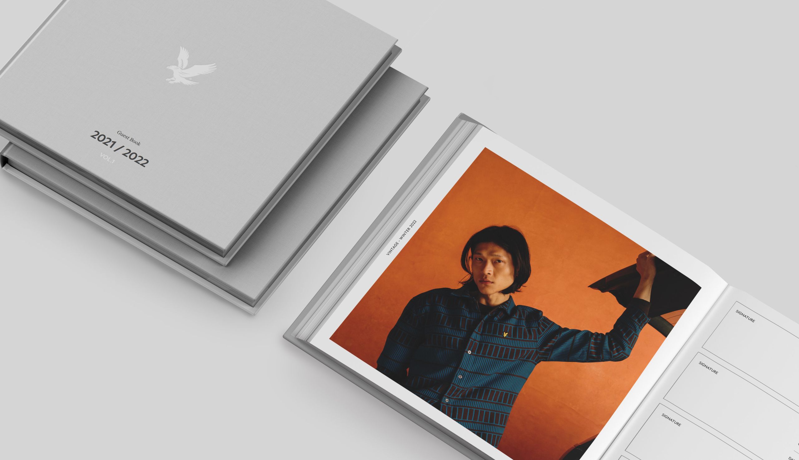
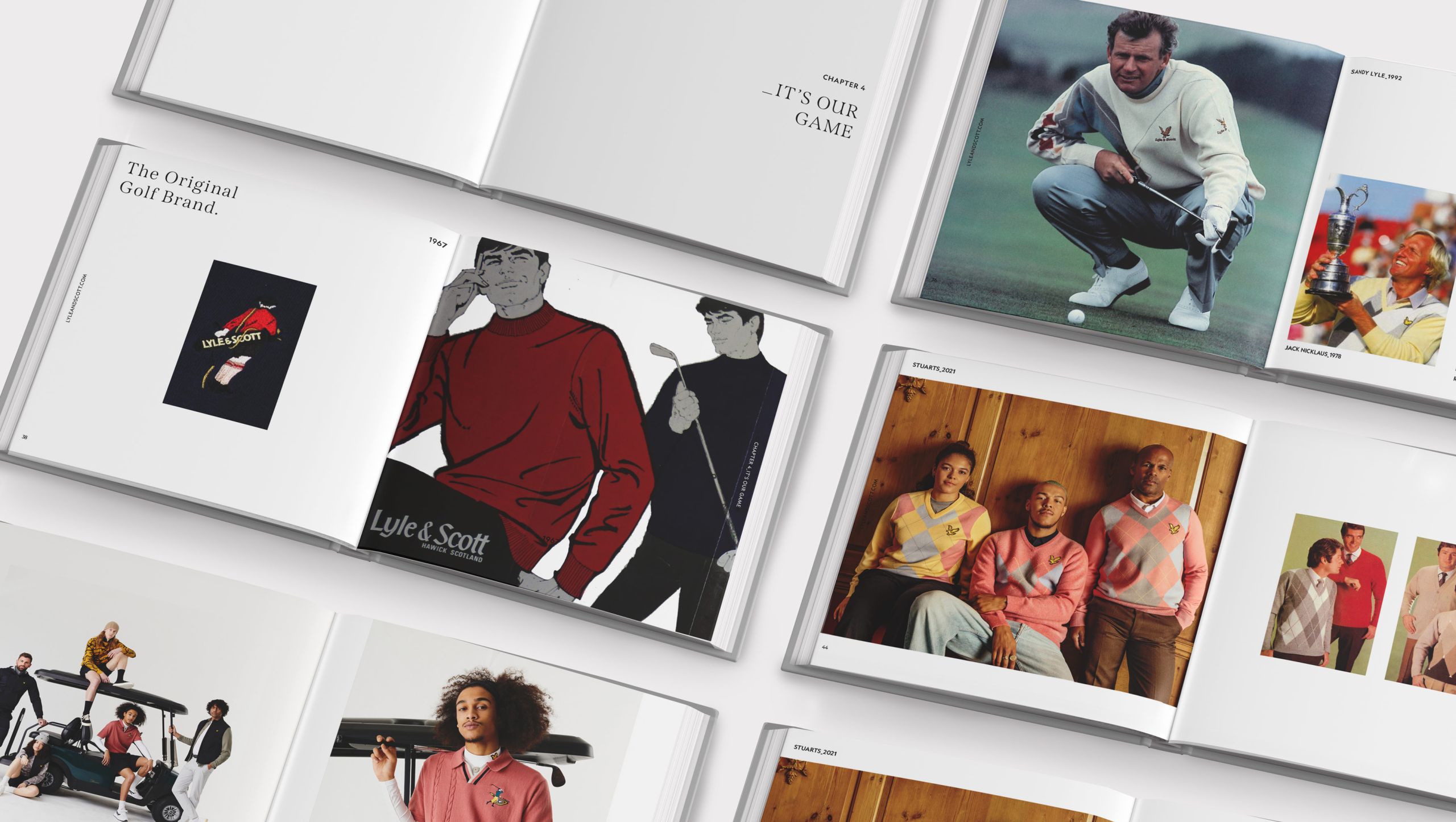
Our campaign included brand design, guidelines, email campaigns and advertisements across posters and magazines throughout the UK.

01 / Understand the brief
Bold block colours and rigid design language alienated potential customers who viewed the brand as dated or unapproachable.
The company needed to retain its heritage while repositioning itself as fashion-forward and accessible to a broader demographic.
The work needed a strong hook that felt relevant to a modern British fashion audience without losing the golden eagle’s history.
02 / Approach
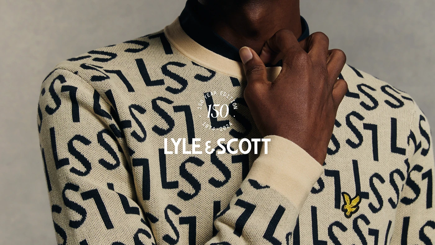
We softened Lyle & Scott’s image with a pastel-led rebrand that modernised its heritage and opened the door to a broader, fashion-forward audience.
03 / Solution
Built to move the work forward.
- 01
Shifted the visual system from hard block colours to a softer pastel palette aligned with contemporary fashion.
- 02
Refreshed typography, photography and layouts to introduce a lighter, lifestyle-led aesthetic.
- 03
Developed brand guidelines across social, website, email and campaigns for consistency at every touchpoint.
- 04
Kept the golden eagle central while presenting it through a fresher, more accessible lens.
04 / Results
Impact that carries.
A visual language designed to welcome a wider fashion audience.
One system spanning social, web, email, poster and print.
A modern repositioning without losing the brand’s defining emblem.
What could we move for you?